Structured reflection
Stage 1: Create a steady, low-pressure structure for emotional reflection.

Preview
These are reusable patterns for therapist-facing library pages. Pick the ones you like and we’ll mix and match per page.
Buttons
These match the Featured Guide CTA styles used on the clinician library index. Use the emerald option as the default unless a page needs more contrast.
Template F adaptation
A vertical-tabs layout adapted from Template F. Designed to avoid a long wall of text while keeping the UI calm and minimal.
These tend to be helpful when used flexibly and matched to context.
Meaning: Schedule and do meaningful or pleasant activities to shift emotional inputs.
Looks like: Even though I feel low, I’ll go for a walk, cook, text a friend, do one small task.
Template A
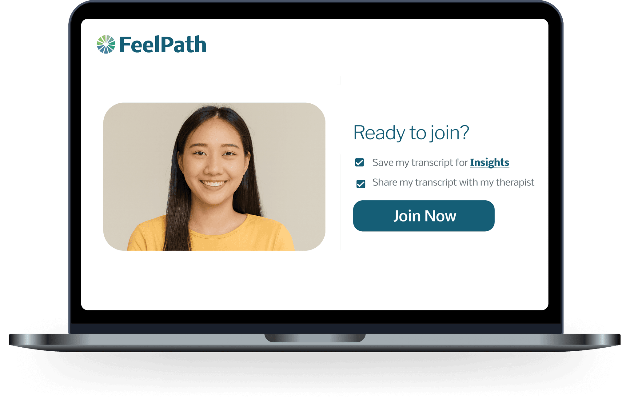
Use for “explain a concept” sections. Minimal copy, 2 to 3 bullets, one image.
Template B
Use to alternate visual rhythm. Same structure, flipped sides.
Template C
Short point 1
One short sentence. No long paragraphs.
Short point 2
Keep it concrete and therapist-native.
Short point 3
Link out if it gets long.
Template D
A calm trust block that pairs one clear point with two concrete signals. Keep the copy short and let the numbers do the work.
Template E
A high-contrast layout with soft depth, designed for calm scanning and quick comprehension.
Template E (chart-only)
Same layout as Template E, but with only the chart mockup (no ‘Statistics’ overlay card).
Template F
“It keeps the session grounded in what was actually said.”
The design is calm enough to stay out of the way, but the outputs are concrete enough to be useful.
When I’m reviewing, I can get oriented quickly without turning therapy into a dashboard.
Template G
Help clients notice patterns across weeks, not by adding complexity, but by keeping the output calm, readable, and grounded in consent.
Overview
Overview
Template J
Attempt 2: rotated ellipses + blend modes to create a smoother ‘river of color’.
Template H
Use this when you want trust + clarity without a wall of text.
A single workflow that reduces duplicate note-taking.
A simple, repeatable structure that fits different modalities.
Clear consent boundaries and privacy-first design.
Continuous improvements without new training modules.
Template I
Explore a calm toolkit designed for disciplined tracking, reflection, and clarity, without overwhelming the session.
Capture key moments as they happen and return to them later with context you can trust.
See where the conversation shifted, so you can review structure without relying on memory alone.
Generate concise, editable outputs that support documentation while keeping clinical judgment central.
Reduce noise by focusing on a small number of interpretable signals rather than dashboards of metrics.
Test small changes in prompts or structure and keep what works, without adding new workflows.
Connect to your existing processes so you can adopt incrementally and stay in control.
Template K
Monitor key moments as they happen. See live notes, active sessions, and insight cues update as the conversation evolves.
Visualize the path through a session, from entry point to resolution or pause, identifying friction points without extra dashboards.
Schedule concise summaries delivered to your inbox. Stay informed without needing to manually check dashboards.
Analyze where clients drop off in follow-through. Use clear signals to improve adherence and reflection between sessions.
Connect seamlessly with your existing workflow and tools so you can adopt incrementally and stay in control.

Template L
Explore insightful articles, expert tips, and the latest news on web analytics, marketing strategies, and industry trends right here on our blog.
Template M
Understand users with our analytics suite. Track interactions, visualize journeys, gain insights on one platform.
Monitor user activity and events as they happen, enabling understanding and reaction to engagement trends.
Gain insights into user demographics, behavior patterns, retention, and segmentation for decisions.
Visualize user progression through flows, identify drop-off points, and optimize conversion paths.
Template N
We believe in taking care of our team. Discover benefits and advantages that make Pixelcloud a rewarding place to build your career and thrive.
Join an inclusive work environment where positive teamwork and shared innovation are valued.
Enjoy the flexibility of working from anywhere, fostering work-life balance and accessing talent pools.
Comprehensive health coverage plans to ensure you and your family are always taken care of.
Quarterly off-site retreats to bond, brainstorm, and recharge in beautiful locations around the world.
Template P
Clause-inspired modular composition: one section carrying the hero, social proof, dashboard preview, integrations, and a testimonial/stats block.
Modular hero preview
Combine session highlights, readable summaries, and lightweight follow-up into one design language that feels modern without becoming noisy.
Social proof row
Features
Use a compact preview with one or two strong signals, a little depth, and generous whitespace. It suggests product sophistication without overwhelming the section.
Explore the workflowReview
Weekly pattern snapshot
Clarity score
84
Steadier session-to-session continuity
Seen by
Shared by the care team this week
Integrations panel
Use a cooler contrast surface to create separation and show product ecosystem depth without adding a second hero.
Testimonial
Sarah Malik
Clinical director, group practice
12 hrs
Average monthly admin time saved per clinician
86%
Teams who say the layout is easier to scan than a dashboard-heavy hero
Template Q
Use stylized UI scenes when screenshots feel too literal, too busy, or too unfinished. This works well for feature explainers and workflow overviews.
Rounded chat shapes plus one floating icon make a product story feel clear before you ever show the real interface.
A profile window, dotted path, and success chip help you imply setup, saving, or structured onboarding in a lightweight way.
A flow-focused composition can explain transfer, routing, or handoff without relying on dense product screenshots.
A simplified chart scene gives you the feeling of analytics while staying calmer and more editorial than a real dashboard.
Template R
A modern feature section with white cards, soft borders, and one vivid accent color doing most of the work. Good when you want a sharper, more current product feel.
Overlapping profile-style cards plus one glowing CTA create a strong focal point without needing a dense product mockup.
Alert
New pattern detected
Layered notifications add depth and help the card communicate speed, freshness, and automated support.
A tag cloud in the background with linked foreground nodes suggests clustering, matching, or synthesis in a visually current way.
Stacked listing cards with a floating accent control work well for feeds, recommendations, or next-step suggestions.
Homepage concepts
The six brand-aligned concepts, ten brighter alternatives, four benefit-first concepts, and two Feelpath Stories video concepts are followed by six rebalanced studies using a more cohesive teal, blue, emerald, and white palette, one paired therapist/client product-view concept, and two workflow studies. These are internal design references; selected studies are also used on the homepage.
Brand direction
01 / RecognitionTherapy moments
When therapy conversations turn toward feelings, some clients have difficulty naming what they feel.
Start with clearer emotion words. Build skills for everyday life.
 Therapist
“When you say you felt bad,
what emotions might be there?”
 Client
“I feel embarrassed and resentful.”
Brand direction
02 / Meaningful transformationWhat meaningful progress can look like

“I noticed I was overwhelmed. So I asked for a little space.”
Illustrative moments of growth; individual experiences vary.
Brand direction
03 / Why Feelpath is differentBuilt from the conversation you already have
Real session language becomes something you can revisit, explore, and learn from together.
“I said I was angry.
But I think I was
hurt, too.”
A client’s words create a place to begin.
Illustrative excerpt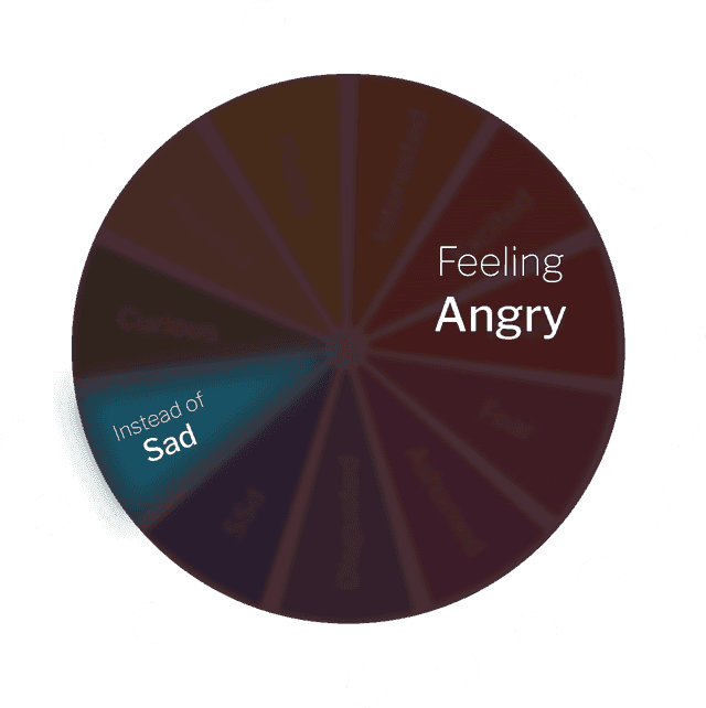 Language to explore together
“Does this fit your experience?”The client’s meaning stays central.
Brand direction
04 / Therapist buyer FAQFor your practice
The practical things you’ll want to know before getting started.
Talk it through with usConsider Feelpath when noticing, naming, and reflecting on emotions supports your client’s goals. You decide together which tools feel useful and when.
Host telehealth sessions on Feelpath and keep your existing EHR. With consent, revisit session language and shared tools during or between appointments.
Review as briefly or deeply as is useful for your work. There is no required between-session review routine. A walkthrough can help you assess the fit.
Clients join their session and can revisit consented session material and emotion tools. You and your client choose what to use, at a pace that feels right.
Start with a 15-minute walkthrough, then get two months free. After that, Feelpath is $39 per month, with clients included.
Brand direction
05 / Simple offerA simple place to start
Start with a 15-minute walkthrough.
See the tools, talk through your workflow, and get your questions answered.
Then $39/month
Brand direction
06 / Final invitationFrom the therapy room to everyday life
Give the moments you create together
more room to grow.
Brighter direction
01 / RecognitionA familiar moment in therapy
“I know something’s there.
I just don’t have
the words yet.”
Your client is engaged. You’re both doing the work.
A shared starting point can help the conversation unfold.
Brighter direction
02 / RecognitionMake room for the feeling
 In the conversation
“I can describe the whole day.
The feeling is harder.”
“Let’s stay with
what you noticed.”
Feelpath gives you something to explore together,
using the language that is already there.
Brighter direction
03 / Meaningful transformation Tuesday. Outside the therapy room.
Skills that travel
Words for a feeling.
Space for a different response.
A need someone can express.
“I could explain what I needed,
instead of pulling away.”
Illustrative moment of growth, not a customer testimonial.
Brighter direction
04 / Meaningful transformationA different way to see progress
The next step may sound
like something new.
“It wasn’t only anger. I felt left out.”
“I asked for a pause.”
“I noticed it sooner.”
“We have something specific to build on.”
Illustrative client and therapist reflections.
Brighter direction
05 / Why Feelpath is differentLearning starts with their language
Real session moments become material
you can return to and explore together.
“I said I was angry.
I think I was
hurt, too.”
What feels true here?
Start with their meaning.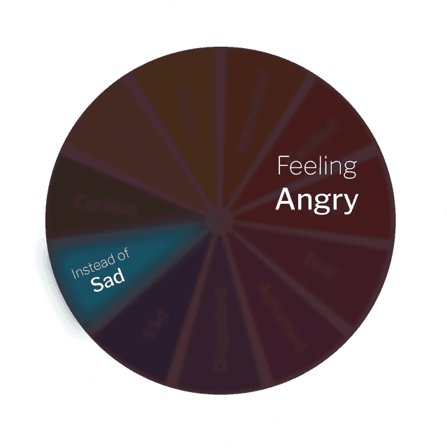
One shared point
of reference.
Brighter direction
06 / Why Feelpath is differentA thread you can keep following
“I felt off.
I’m not sure
how to name it.”
A starting point in the client’s own words.
Illustrative exampleConnected to the conversation.
Grounded in the person.
Brighter direction
07 / Therapist buyer FAQBefore you get started
Therapists and clients working on noticing, naming, and reflecting on emotions. You decide together which tools support the work.
You can keep your EHR. Host telehealth sessions on Feelpath, then revisit consented session language and shared tools during or between appointments.
There is no required between-session review routine. Explore material as briefly or deeply as is useful. A walkthrough can help you judge the fit.
Clients join their sessions and can return to consented session material and emotion tools. You choose together what to use and when.
Book a 15-minute walkthrough, then get two months free. After that, it is $39 per month, with clients included.
There’s room for your questions, too.
Let’s talkBrighter direction
08 / Simple offerOne simple way to begin
A 15-minute walkthrough.
See the tools. Talk through your practice. Ask anything.
Clients included
Brighter direction
09 / Final invitationThe work can keep going
From the therapy room to everyday life.
Brighter direction
10 / Final invitationFor the moments that follow
Help clients bring the language
they find in therapy into
the lives they’re living.
In session.Benefit-first direction
More ways to build emotion skills
Emotion tools to explore together, practice to take into life,
and meaningful changes you can recognize along the way.
“I feel overwhelmed.
I need a little space.”
“I found words
for what
I needed.”
What feels different
to you?
Explore feelings together with shared emotion tools.
Practice noticing feelings and expressing what matters.
“I feel overwhelmed.
I need a little space.”
Notice and discuss changes in emotional language over time.
“I found words
for what
I needed.”
What feels different
to you?
Benefit-first direction
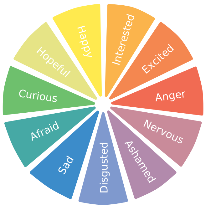
More than a static emotion wheel
Feelpath turns the wheel into a personalized learning system—bringing it into the session, building practice from the client’s own words, and making progress visible.
A shared place to beginBenefit-first direction
A feeling. A skill. A change you can notice.
Give emotion work somewhere to grow—with shared tools,
room to practice, and progress you can explore together.
Make space for
“What fits for you?”
“I’m overwhelmed.
Can we pause?”
Practice noticing a feeling
and expressing a need.
“I can tell the
difference now.”
Notice changes in how
feelings are understood
and described.
Benefit-first direction
From understanding a feeling to using a skill
In the middle of an ordinary day.“Overwhelmed feels closer than angry.”
Illustrative imagery and reflections.
Feelpath Stories direction
Meet Theo, a therapist, and Ellie, his client. See why they chose Feelpath for their work together.
Feelpath Stories direction
Ellie explores her feelings during session, revisits her conversation with Theo, and makes a different choice the next time.
Rebalanced direction
01 / Meaningful transformationA different way to see progress
The next step may sound
like something new.
“It wasn’t only anger. I felt left out.”
“I asked for a pause.”
“I noticed it sooner.”
“We have something specific to build on.”
Illustrative client and therapist reflections.
Rebalanced direction
02 / Meaningful transformationTuesday. Outside the therapy room.Skills that travel
Words for a feeling.
Space for a different response.
A need someone can express.
“I could explain what I needed,
instead of pulling away.”
Illustrative moment of growth, not a customer testimonial.
Rebalanced direction
03 / RecognitionMake room for the feeling
In the conversation“I can describe the whole day.
The feeling is harder.”
“Let’s stay with
what you noticed.”
Feelpath gives you something to explore together,
using the language that is already there.
Rebalanced direction
04 / Final invitationFor the moments that follow
Help clients bring the language
they find in therapy into
the lives they’re living.
In session.Rebalanced direction
A feeling. A skill. A change you can notice.
Give emotion work somewhere to grow—with shared tools,
room to practice, and progress you can explore together.
Make space for
“What fits for you?”
“I’m overwhelmed.
Can we pause?”
Practice noticing a feeling
and expressing a need.
“I can tell the
difference now.”
Notice changes in how
feelings are understood
and described.
Rebalanced direction
Ellie explores her feelings during session, revisits her conversation with Theo, and makes a different choice the next time.
Product evidence direction
Two people. A shared point of reference.
An activity built around Maya’s words and the moment you explored.
Notice one moment you need a pause.
Review the wording with Maya before sharing.
Ready to review togetherConcept 06 · Proposed paired views; all client information is fictional
Workflow direction
Between-session analytics
A clearer view of your client’s development over time.
Homepage concept · illustrative client, measurements, and workflow
Workflow direction
Between-session review · 8 analyzed sessions
Concept interface · fictional client and data · lower example indices indicate less difficulty
Workflow direction
How it works
Turn session language into shared tools for reflection, practice, and visible progress.

Host sessions on Feelpath and use shared emotion tools when they are helpful.
Feelpath turns consented session language into reflection, emotion tools, and note drafts.
Emotion labeling rate
+93%
Emotion words per 1,000 words
Notice clearer feeling words, emerging patterns, and skills clients use beyond the session.